SocialSpot
A platform that helps users discover and enjoy social spots like parks, restaurants, bars, and clubs.
MY ROLE
UX/UI DESIGNER, RESEARCHER
DURATION
3 MONTHS
RESPONSABILITIES
UX RESEARCH, VISUAL DESIGN, WIREFRAMING, PROTOTYPING


PROJECT OVERVIEW
SocialSpot, is designed to help users find and enjoy social spots such as parks, restaurants, bars, and clubs. It provides a seamless experience for discovering, planning, and coordinating outings with friends.
BACKGROUND
In today’s fast-paced world, finding the perfect spot to meet friends can be time-consuming and frustrating. Many existing apps either lack comprehensive information or are not user-friendly, leading to a fragmented experience.
THE PROBLEM
Users face difficulties in finding suitable social spots due to the overwhelming number of options and lack of reliable information. Coordinating outings with friends is often a cumbersome process involving multiple apps.
OBJECTIVES
-
To simplify the process of finding and choosing social spots.
-
To enhance the social experience by providing detailed information and user reviews.
-
To facilitate easy coordination and planning of meetups with friends.
THE SOLUTION
MY DESIGN PROCESS
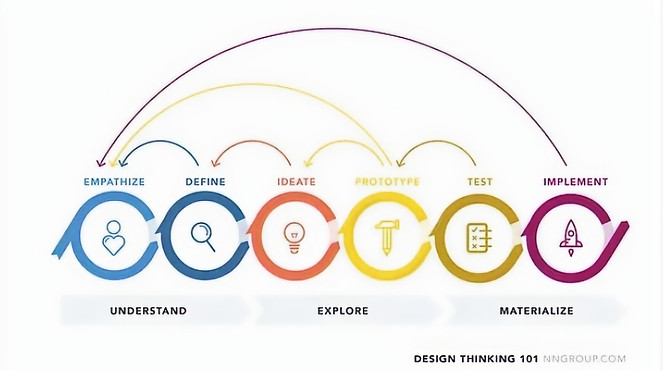
Having clearly in mind that the design process is not linear, I started my project with the first phase of the design process knowing for certain that I would have to come back an revisit every phase as needed in order to generate a result that completely aligned with the users' needs and objectives set out initially.
GETTING TO KNOW THE USER
RESEARCH AND DISCOVERY
User Research: I conducted surveys and interviews with 8 young professionals in Santo Domingo city, Dominican Republic to understand their habits, preferences, and pain points related to finding social spots and planning outings.
Competitor anaylis: I analyzed competitors like Yelp, Foursquare, and Google Maps to identify their strengths and weaknesses. During this phase, I discovered a gap in integrated planning and coordination features as well as lacking intuitive and easy to understand interface that allows users to easily discover a social spot around the city.
Key Findings:
Convenience: Users prioritize ease of use and quick access to information.
Trust: Safety and reliability are critical, with users valuing verified profiles and comprehensive reviews.
Availability of places and options: Users value the variety and availaility of different options when it comes to finding a special please for a meet up.
User Pain Points
1
Number of options
Users often feel overwhelmed by the sheer number of options available for social spots. Existing platforms provide too many choices without effective filters or recommendations, making it hard for users to decide where to go.
2
Lack of detailed information
Many existing apps and platforms do not provide comprehensive information about social spots. Users need to visit multiple websites or apps to gather details like reviews, photos, and amenities, leading to a fragmented experience.
3
Coordinating with Friends
Coordinating outings with friends can be cumbersome, often requiring multiple apps for messaging, planning, and organizing events. This disjointed process leads to confusion and inefficiency.
4
Unreliable User Reviews
User reviews on existing platforms can be unreliable or inconsistent, making it difficult for users to trust the information provided. Fake reviews and lack of context can further exacerbate this issue.
User Personas
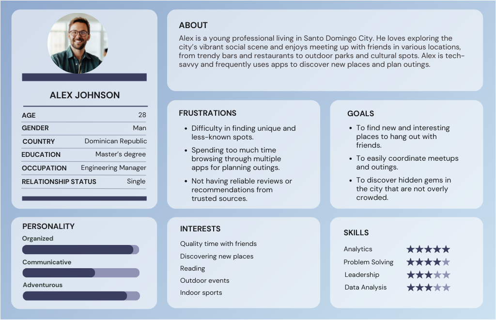
I developed detailed personas like Alex Johnson, a 28-year-old marketing manager who loves exploring new places and meeting up with friends. Alex’s needs and behaviors informed many of my design decisions.
User Journey Map

STARTING THE DESIGN
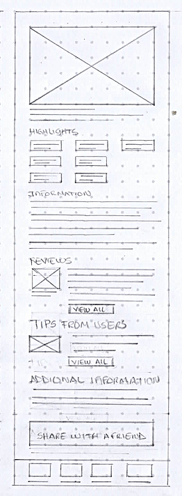
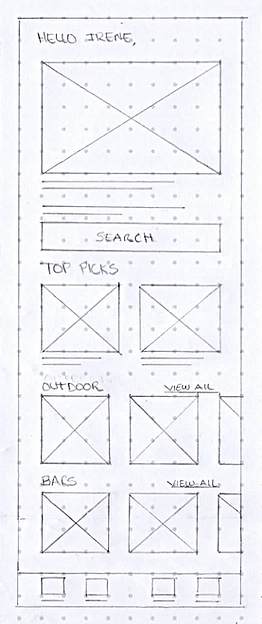
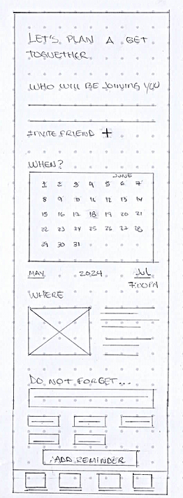
Now that I have a better Idea of the user, their beheviors and their needs, I can start sketching up the wireframes to shape the idea and iterate to get to the best solutions and features.
PAPER WIREFRAMES


DIGITAL WIREFRAMES
With the paper wireframes already laid out, I started the digital wireframes, including the best features and options that make the design adjusted to the user's need and requirements. In this section, you will find the key features that I decided to add to make the user experience intuitive and easy to navigate.
Main Banner that will show featured places, special ocassions and offers.

Section that will feature personalised recommendations based on users preferences and previosly gathered information
Dedicated categories section so that user can find easily what they are looking for.
Best rated section to show the best rated places by users reviews

Reviews section, so users can check the reviews from pervious verified users.
Description section where users will see the main information about a place. This will include a highlights section.
Additional information section. Users will see important information about the place.

User will be able to add their friends name or user to plan a meet up
Users can choose a date and time in the planner section
Do not forget section. Users cann add tags to highlight important things or reminders
LOW FIDELITY PROTOTYPE
REFINING THE DESIGN
DESIGN SYSTEM AND STYLE GUIDE

HIGH FIDELITY MOCKUPS

USABILITY TESTING
In this phase of the project, I invited 5 participants from 18-35 years. This included family and close friends. The usability sessions were conducted in person for this project. I showed them the prototype and while they were using it I took notes of their feedback and their engagement and interaction with the prototype. The following changes resulted from the main comments and feedback that came up from the usability sessions:

Before

After
The main change that resulted from the usability sessions, included adding the icons bar where users can see the main highlights of the places they are interested in. This highlights were added previosly on the description screen. However, in the " Favorites" section this had not been previosly added.

Before

After
In the results page, users also reported that they would like to be able to check the main highlights of the places so that they can verify the amenities without actually clicking on the item for a detailed description. This feedback was well received and incorported in this screen.
FINAL MOCKUPS


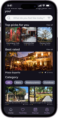
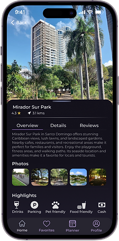


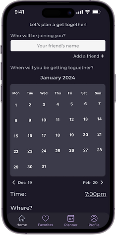

CONCLUSIONS
CHALLENGES
Some of the challenges I faced over the course of this project included finding a way to make the app appealing and easy to navigate for users. This meant to show the most important information without making the process overwhelming for the user. I decided to check out several options of visual interface and layout so I could find the best way possible the app would look intutitive and simple.
LESSONS LEARNED
Working on this project I allowed me to understand that design is never done and there are always improvement opportunities, whilst I could call it a project, I know for certain that I can keep iterating on the project and getting users' feedback and the project will keep getting better and more suited to the users' needs and requirements.
One lesson I can showcase and that always comes up in projects no matter the type, is that the options I personally found were the most appropiate, ended up not being as good as I thought in the beginning of the project. Therefore, flexibility and open mind is key to avoid any personal bias that I might have over the course any project. Additionally, welcoming feedback was essential for this particular project and will be essential for future projects I will be working on.


